Three products, one design system
 Darren Hoyt
Until recently, SageSure’s three flagship products—a policyholder portal, an agent portal, and a servicing application—appeared to have adequate visual similarities tying them together despite differences in code.
However, once SageSure’s design system initiative began in earnest and all three were closely evaluated, it was clear the products deviated from each other in a number of important ways, leading to inefficiency and confusion.
A shared philosophy
SageSure’s digital team began to realize that even though the three products had unique purposes, they shared enough in common that unifying and componentizing their building blocks would increase team velocity as well as reduce ambiguity during the transition from design to engineering. So we set about creating a system based on atomic design principles that would provide our teams with a common vocabulary and help them build features with a shared philosophy.
With three unique experiences to consider, we had to ask ourselves: can these apps in fact be unified in both design and code? Should they? What are the advantages? Is it a good use of our time? We began to explore the trade-offs involved.
One of the conclusions was that, even though our current products have three siloed audiences that would unlikely experience the unification effort, SageSure’s designers and engineers would benefit greatly and a unifying system would help validate our design principles at scale. Additionally, the workflows of our traditionally-siloed audiences are increasingly overlapping, necessitating a system to help deliver a coherent, unified experience to all our customers.
Piecing it all together
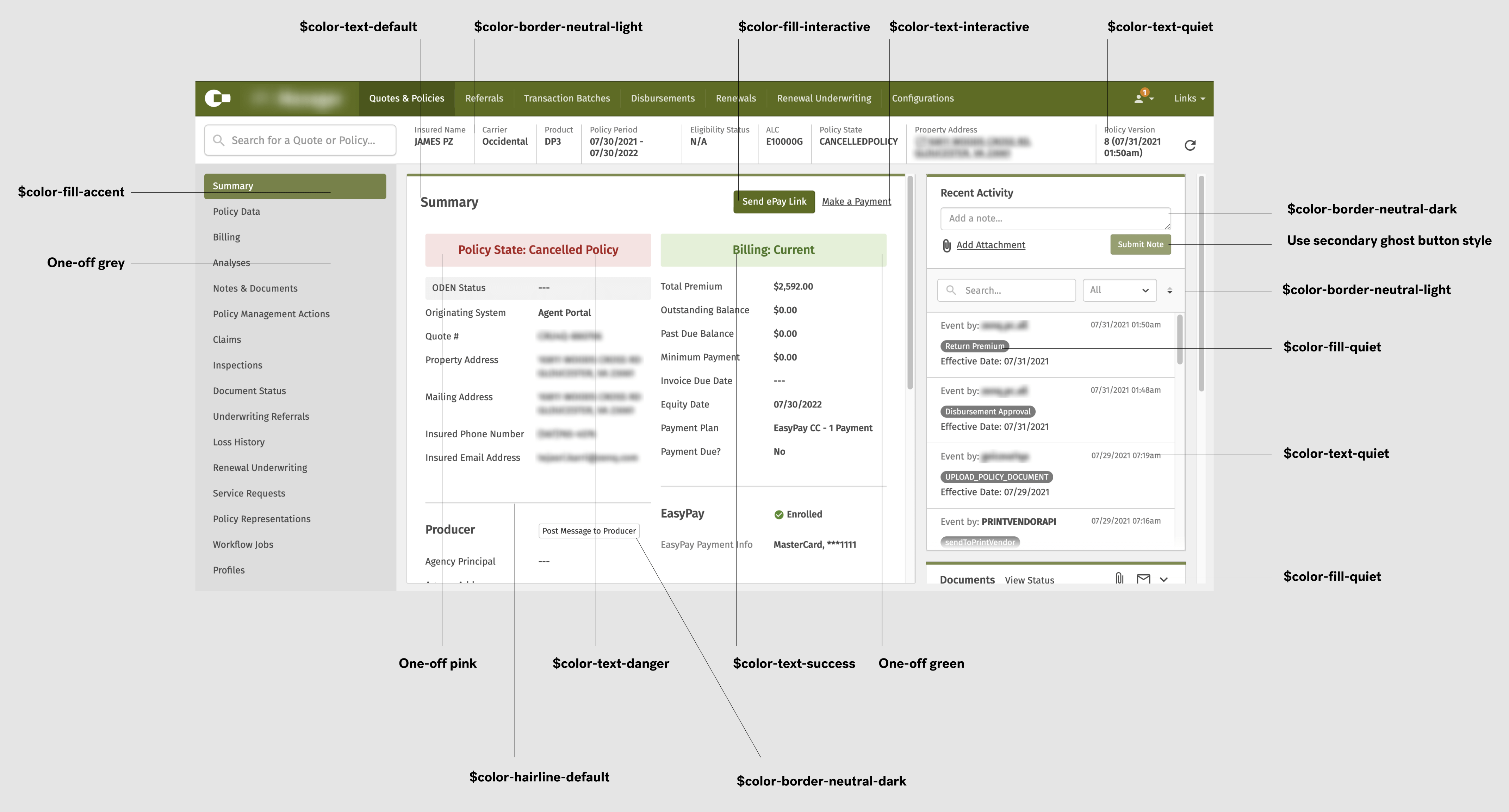
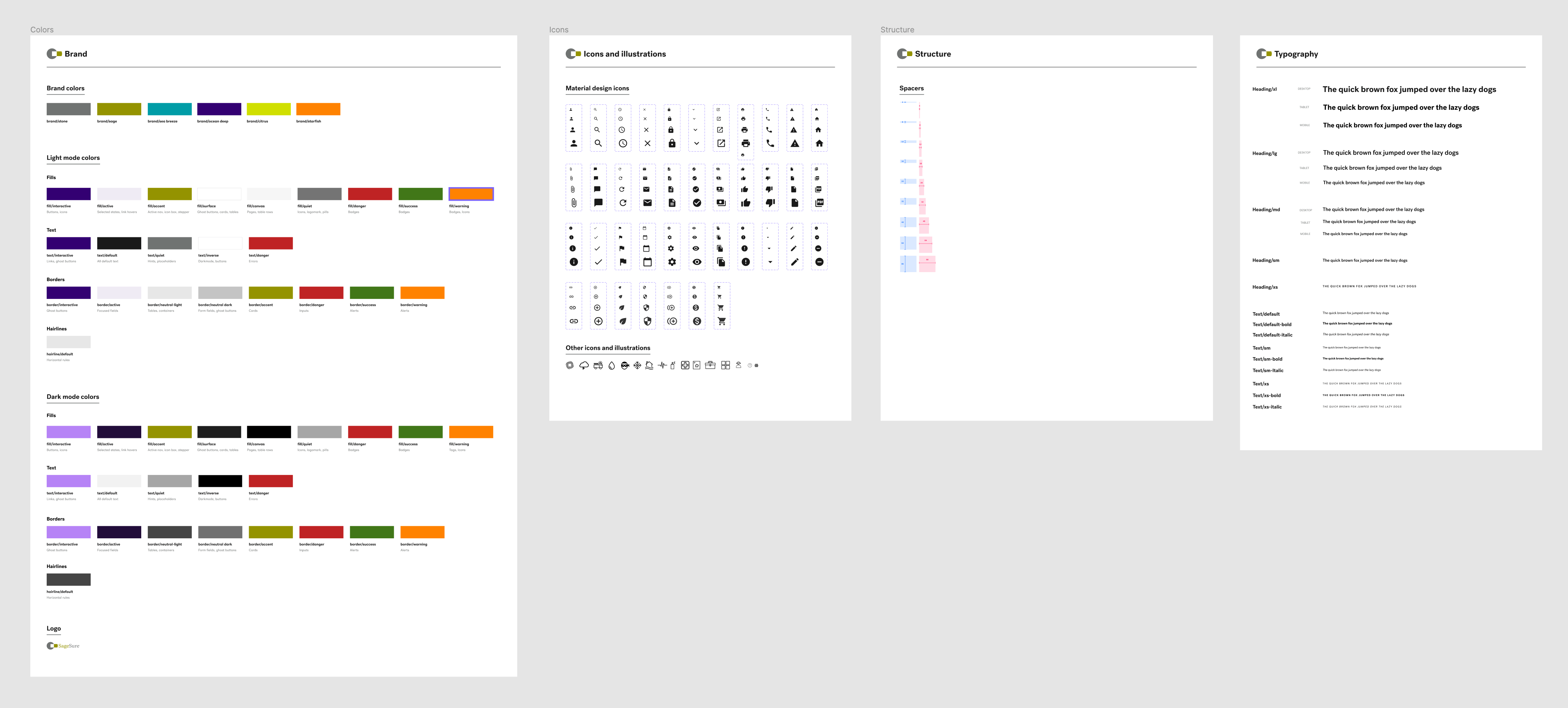
The first step was doing an audit of the three products and making note of all the visual similarities and differences. Focusing first on simple foundational elements such as color, spacing, and typography, we explored the possibilities and ultimately found middle-ground solutions that would work in all three contexts without causing disruption to the existing UI.
That process also helped us codify simple guidelines (ex: use the fill/active color token for navigation states) so that designers would always understand what to use and when, regardless of the product.
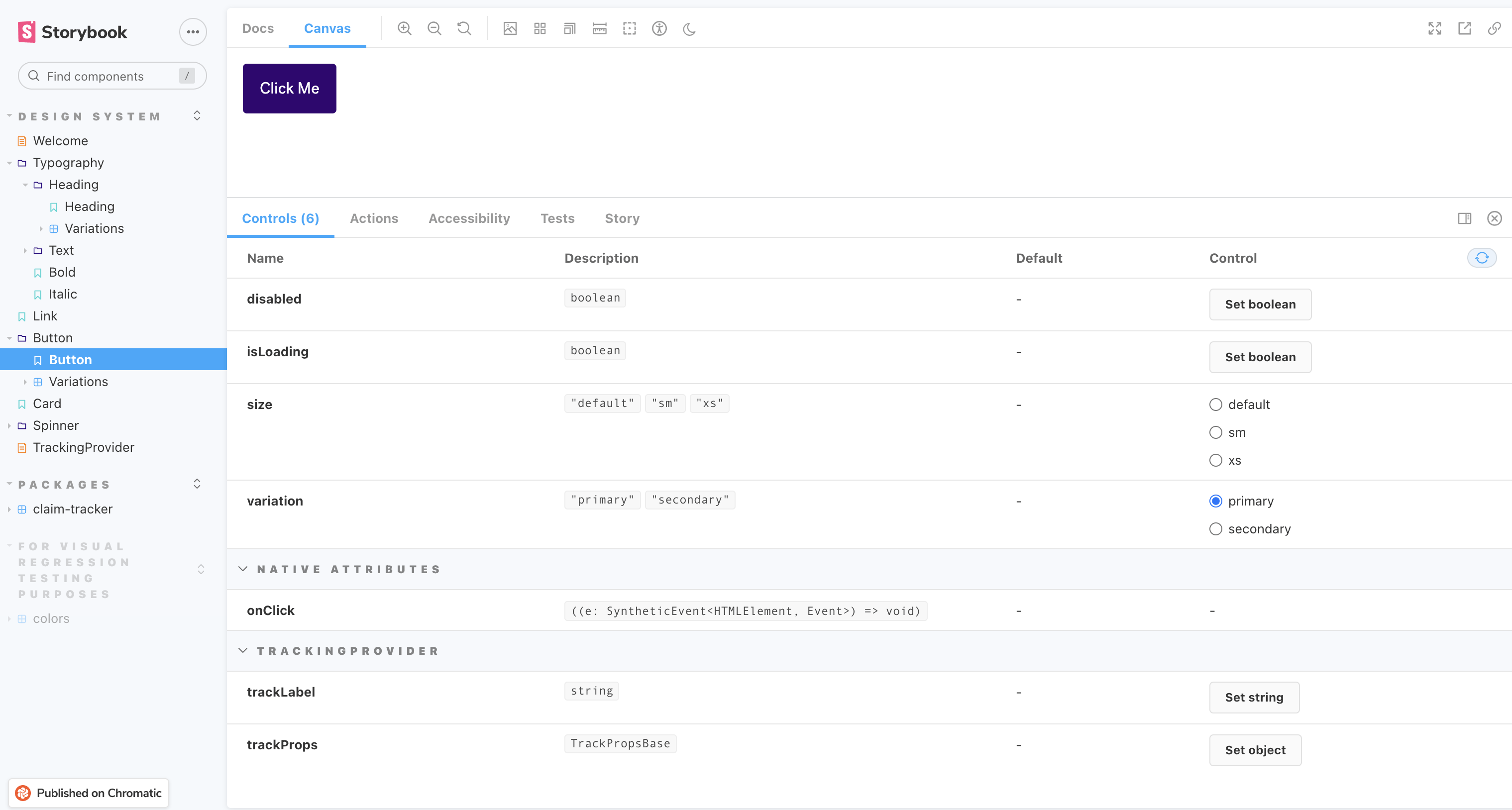
From there we designed more complex pieces (ex: buttons, dropdown menus) that had easily identifiable purposes while also being visually broad enough to work seamlessly in all three products. One at a time, we staged them in Figma and discussed their variants and states along the way. Each one was then coded, added into Storybook, QA’d, and released to the teams to begin integrating them.
Bit by bit, we tied our products together using Storybook as a centralized source of truth. The process also helped us define a contribution model for creating new components.
A holistic product
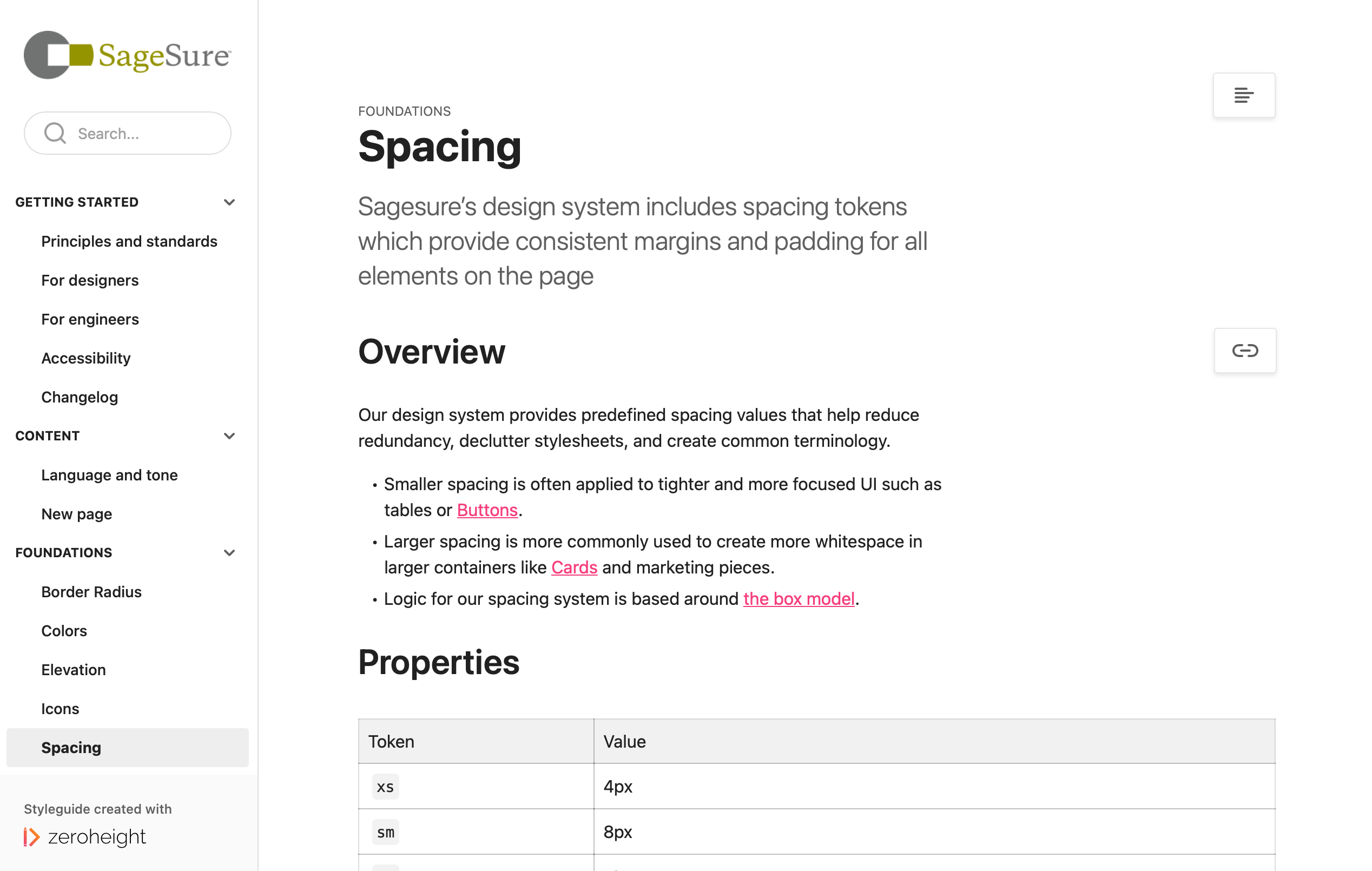
One important note: until recently, many companies have defined “design system” as a simple UI kit for designers to prototype features. At SageSure, we consider the beginnings of our system to be a holistic, overarching product with three crucial touch points—a UI kit in Figma, a Storybook site where components are consumed, and a documentation site for guidance around usage (as well as serving as a great onboarding tool to help new employees understand the principles upon which we built the system).
Building a design system for multiple products can seem daunting and there are challenges to keeping everything aligned. But purposeful, well-defined global styles and proper tokenization glueing things together has helped our teams build applications with increasing confidence and clarity.